
Customize your Knowledge Base logo, colors, and theme
Make your Knowledge Base feel like part of your product. Set logos, a favicon, accent colors, and light or dark themes, then review and save your branding.
Make your Knowledge Base feel like part of your product. Add your logo and browser-tab icon, choose readable brand colors, and offer a light or dark theme that works for your customers.
Go to Knowledge Base → Site → Appearance. Branding settings are on the left, with a Preview of the saved site on the right.
Saving appearance changes updates your site's branding. If your Knowledge Base is live, visitors can see the saved changes without a separate article-publishing step. Saving appearance does not publish draft articles or take an unpublished Knowledge Base live.
Add your logos and favicon
Use the Brand section to choose the images shown on your public Knowledge Base.
| Setting | Where it is used |
|---|---|
| Light logo | Your site header in light mode, and automatically generated social share images. |
| Dark logo | Your site header in dark mode. If empty, the light logo is used instead. |
| Favicon | The small icon in browser tabs. If empty, your workspace icon is used when one is available. |
- Select Upload beside the image you want to add.
- Choose a PNG, JPG, GIF, or WebP file, up to 5 MB.
- Check the image in its asset card.
- Select Save when your changes are ready.
Start with a light logo as your primary wordmark, then add a dark-mode alternative that remains visible on a dark background. For the favicon, use a square image at least 64 × 64 pixels. Export vector artwork to a supported image format before uploading it.
Once an image is set, Upload becomes Replace. Select Remove and then save to remove a saved image. If you remove a newly selected replacement before saving, Weav first cancels that pending upload and restores the previously saved image. Remove again if you also want to remove the saved image.
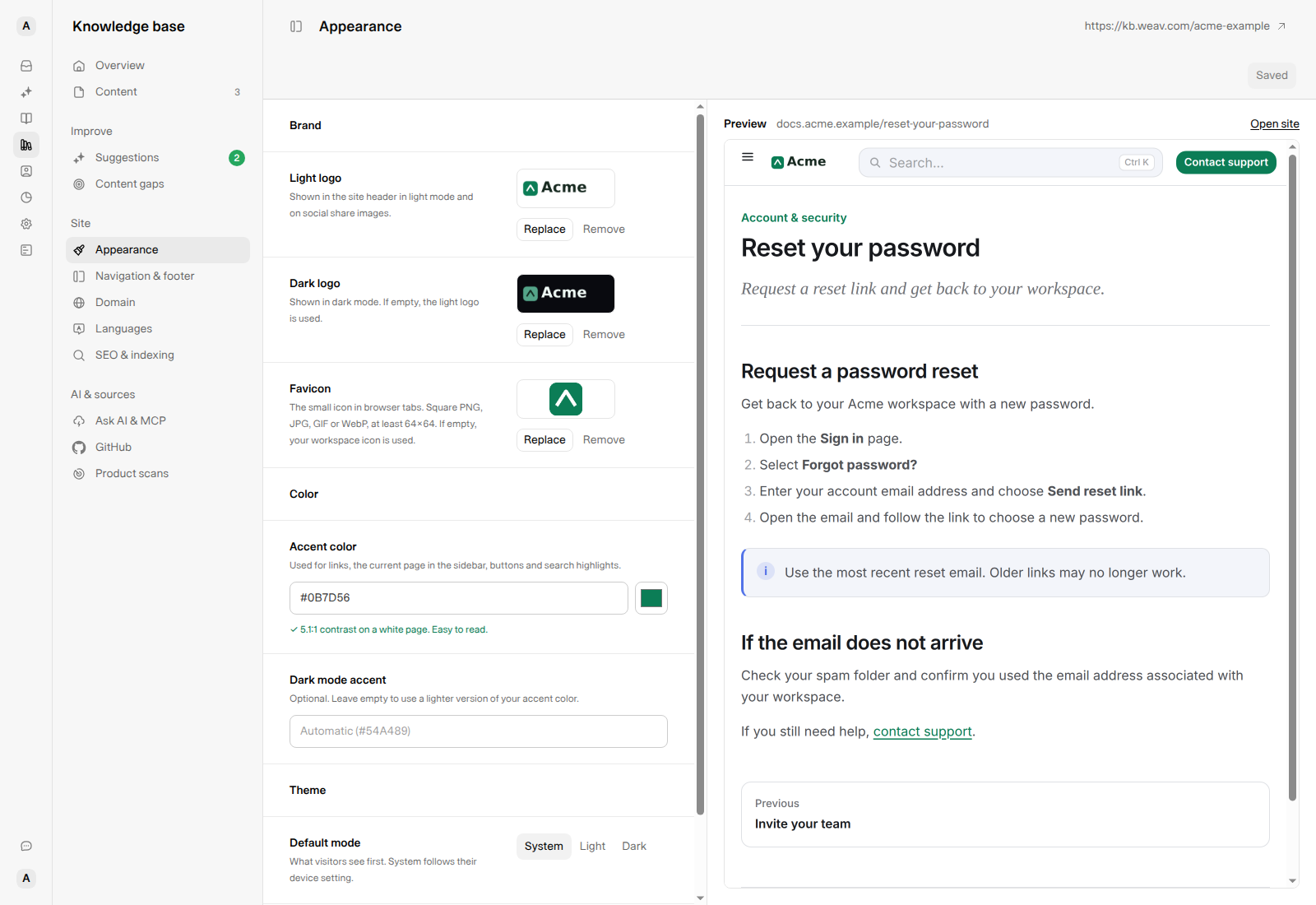
Use separate light and dark wordmarks when a single version would disappear against one of the backgrounds.
Choose your accent colors
Accent color
In Color → Accent color, enter a six-digit hex color, such as #0B7D56, or use the color picker. Include the leading # when typing a value.
The accent is used for links, the current page in the sidebar, buttons, and search highlights. Leave the field empty to use Weav's default accent, #2052EB.
Weav checks the accent against a white background:
- 4.5:1 or higher shows a confirmation that the color is easy to read.
- Below 4.5:1 shows a warning and recommends a darker shade. A valid low-contrast color can still be saved, so choose carefully.
- An invalid value shows Enter a hex color like #0B7D56. and must be corrected before saving.
Dark mode accent
Leave Dark mode accent empty to use a lighter version of your main accent. Its placeholder shows the automatic value. For example, Automatic (#54A489) for #0B7D56.
Enter another six-digit hex color if you want a separate dark-mode accent. This does not change your main light-mode color.
Check both themes, not just the contrast message. The displayed contrast check compares your main accent with white; it is not a complete accessibility audit or a separate check of the dark-mode accent. Review actual links, buttons, and logos in both modes.
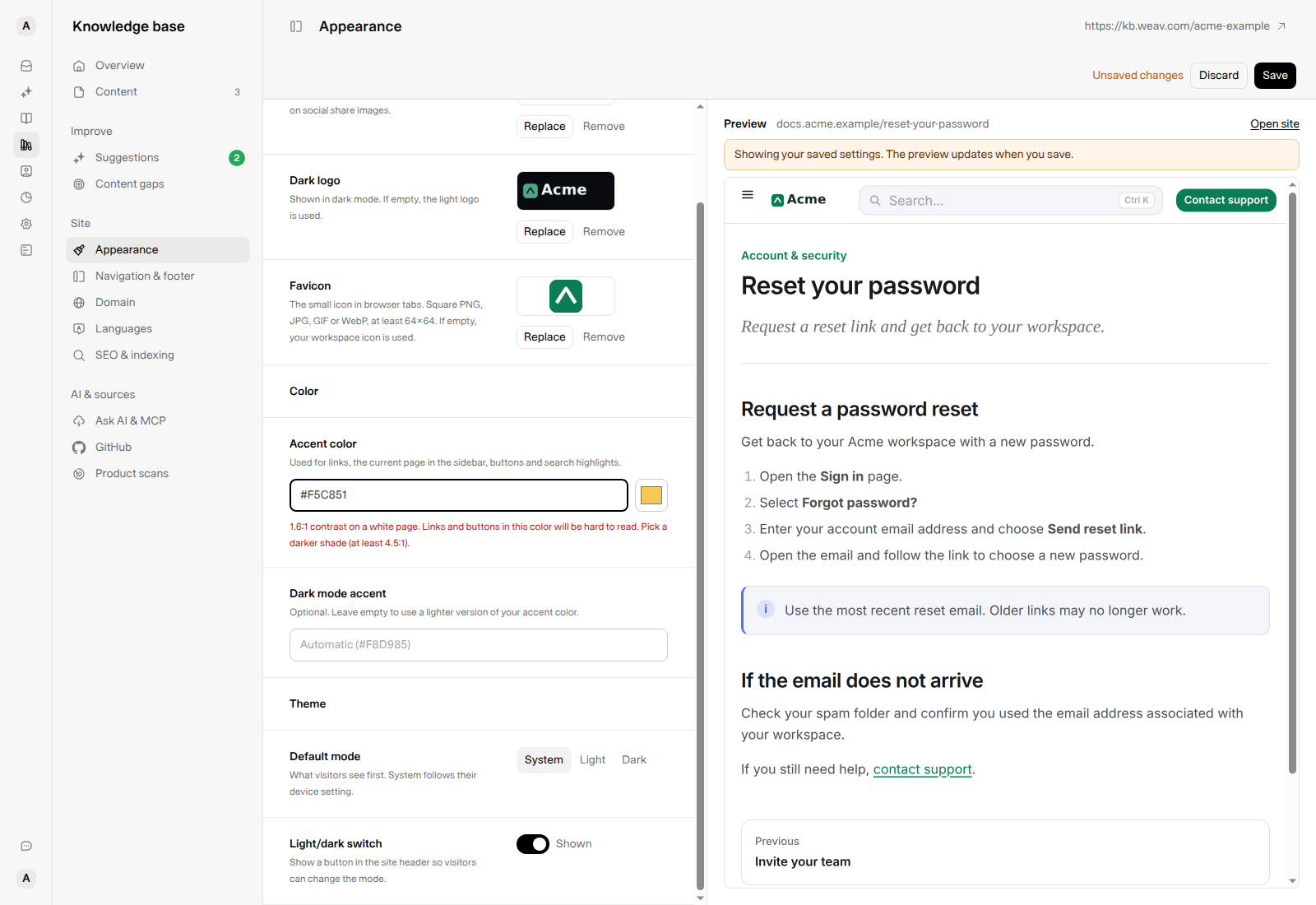
The example yellow is an unsaved edit. The preview remains green because it shows the saved site, not pending changes.
Set the default theme and visitor switch
In Theme → Default mode, choose how the site opens for a visitor who has not already chosen a theme:
- System follows the visitor's device preference.
- Light starts with a light background.
- Dark starts with a dark background.
Set Light/dark switch to Shown if visitors should be able to change the mode from the public site's header. Set it to Hidden to remove that control.
With the switch shown, the site remembers a visitor's light or dark choice in that browser. This can override your default on later visits. Hiding the switch makes the saved default mode apply instead of restoring that stored choice; System still follows the device preference.
These settings apply to the public Knowledge Base, not the appearance of your Weav workspace.
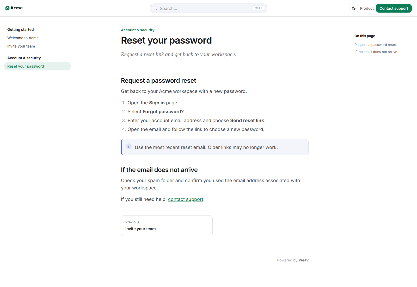
Light-mode example
Dark-mode example
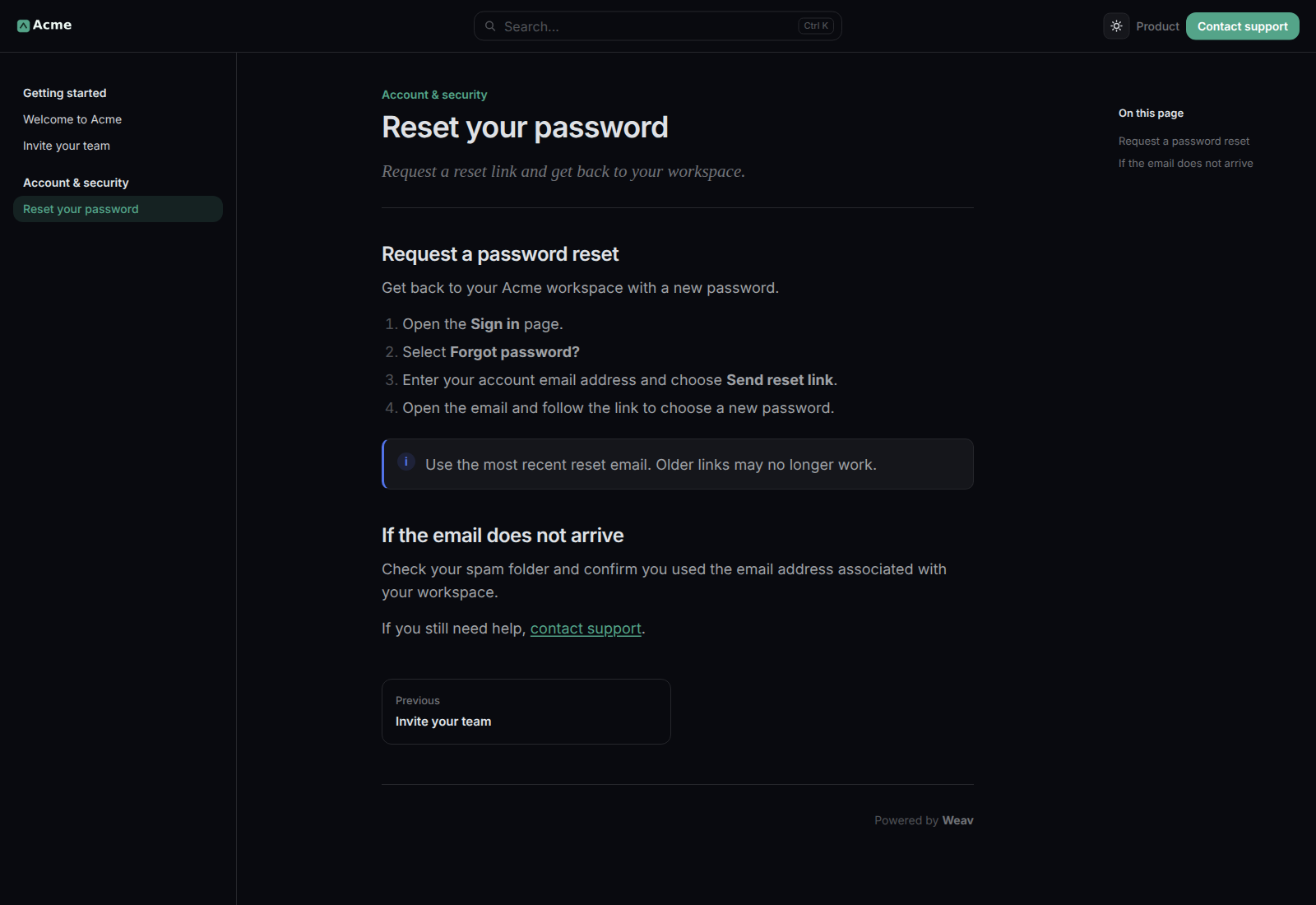
The examples use the current public Knowledge Base renderer with fictional Acme content and locally generated branding.
Save, preview, or discard changes
After an edit, the top bar shows Unsaved changes, Discard, and Save.
- Finish your logo, color, and theme changes.
- Select Save to apply the settings, uploads, and removals together.
- Wait for Appearance saved. The button changes to Saved, and the preview reloads.
- Use Open site to inspect the full-size site and check both themes.
The preview shows saved settings. Choosing an image updates its asset card, and color fields update their controls, but the site preview does not show those pending edits. While changes are unsaved, it says Showing your saved settings. The preview updates when you save.
Select Discard and confirm to reset unsaved edits to the last saved appearance. Leaving the page with pending edits also prompts you about unsaved changes.
If a value is invalid or saving fails, correct the displayed error and try again. A failed appearance save leaves the previous saved settings and images in place; do not assume that seeing a newly selected image in its card means it was uploaded successfully.
Review branding after a help-center import
When you import a help center from its web address, Weav can bring over detected logos and accent colors into empty branding fields. Branding you have already set is not replaced by the detected values. The favicon is not changed by this import.
Review Appearance after the import finishes. If a logo or color could not be detected or downloaded, set it manually here; that does not stop the articles from being imported. You can replace imported branding using the same controls as any other appearance change.
Frequently asked questions
Why does my preview still show the old color or logo?
Check the top bar for Unsaved changes. The site preview reloads after a successful save, not every time you edit a field. If a browser-tab icon still looks old after saving, refresh the page or check in a fresh browser session because browsers can cache favicons.
Why does a visitor still see dark mode after I choose Light?
When the light/dark switch is shown, a saved visitor choice can take precedence over the default. Check the theme switch or use a browser session without a previous choice when reviewing the default.
Why is my logo hard to see in dark mode?
If Dark logo is empty, the light logo is reused. Add a dark-mode version with enough contrast, save, and check the public site in dark mode.
Does Appearance control my navigation and social sharing image?
Use Site → Navigation & footer for announcement banners, header links, buttons, and footer links. Use Site → SEO & indexing to set a custom default social sharing image; appearance logos and that sharing image are separate settings. See SEO and discoverability for your Knowledge Base.
For the complete setup and capabilities overview, see Getting started with your Knowledge Base.